aurora
Support after birth
Aurora is a platform for people living with postpartum depression, and for the people around them. It was my bachelor thesis, made with Jasmin Klement and Hana Amer. What drew me in was how design can carry someone who has no strength left to go looking.
The emotional imbalance after giving birth is widespread, goes far beyond the baby blues everyone has heard of, and gets less attention than it needs. The concept was developed and validated in close collaboration with people affected, people who had been affected, specialists and institutions in the field.
Role
Context
October 2021 – February 2022
Supervision
The most common illness after giving birth — and almost nobody talks about it.
Background on PPD
Postpartum depression is a mental illness that mainly appears in women after birth, though partners can be affected too. It is commonly called childbed depression and is often confused with the postpartum mood dip known as the baby blues.
There is no single cause. Early childhood experience, a difficult pregnancy, a traumatic birth, the hormonal shift or a family history can all play together. Because the symptoms differ from person to person, the diagnosis itself is hard — and because shame and fear of the consequences keep people silent, it usually comes too late, if it comes at all. The average wait is 5.7 weeks for a first consultation and 20 weeks for a therapy place.
The problem
Up to 22 per cent of pregnant women in Germany develop postpartum depression, around a hundred thousand a year. Anyone who then looks for help meets a system that is not set up for it. And the illness takes away exactly what you would need to work your way through that system.
Who it is for
Primarily mothers who are affected and their partners; secondarily the people around them — family and friends. Those are often the ones who react with incomprehension, which is exactly why they belong here: anyone who wants to help has to understand what is happening first.
Outcome / solution
What mattered to us was being a place to start, and helping with every step after it. A signpost that portions the subject out, explains it, and then stays alongside until you have chewed through it. Not a mountain of knowledge at once, but whatever is next.
The solution takes on the problem areas around the illness: through connected parts — a website, an app, a campaign and a tool for specialists — people get content cut to their own situation.
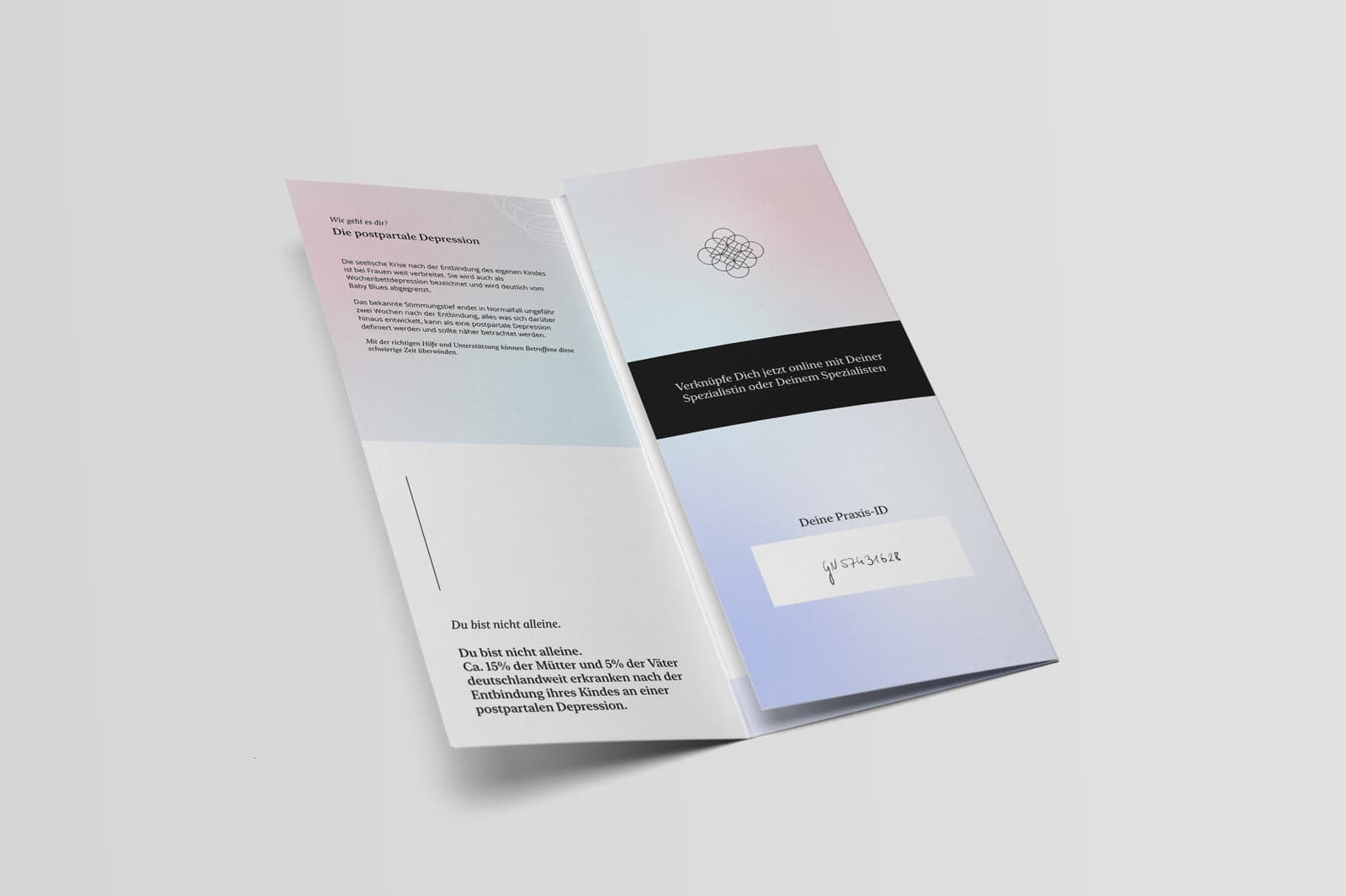
From the first research to the hand-in.
The order is right; the documentation dates only the start and the hand-in.
Research
„5 per cent, so one man in twenty, develops a postpartum depression himself. What stood out was that of the ten affected men we studied, only one took up therapeutic help.“
Conversations with every group a postpartum depression involves: the women themselves, their partners, the people close to them — and on the other side midwives, gynaecology, therapy and a clinic. Six groups, because the illness never affects one person alone.
The concept
The research turned into six parts that work together: a website at the centre, an app as a mobile companion, the mentor programme for contact with others who have been through it, and a direct line to specialists — in an emergency with no detour.
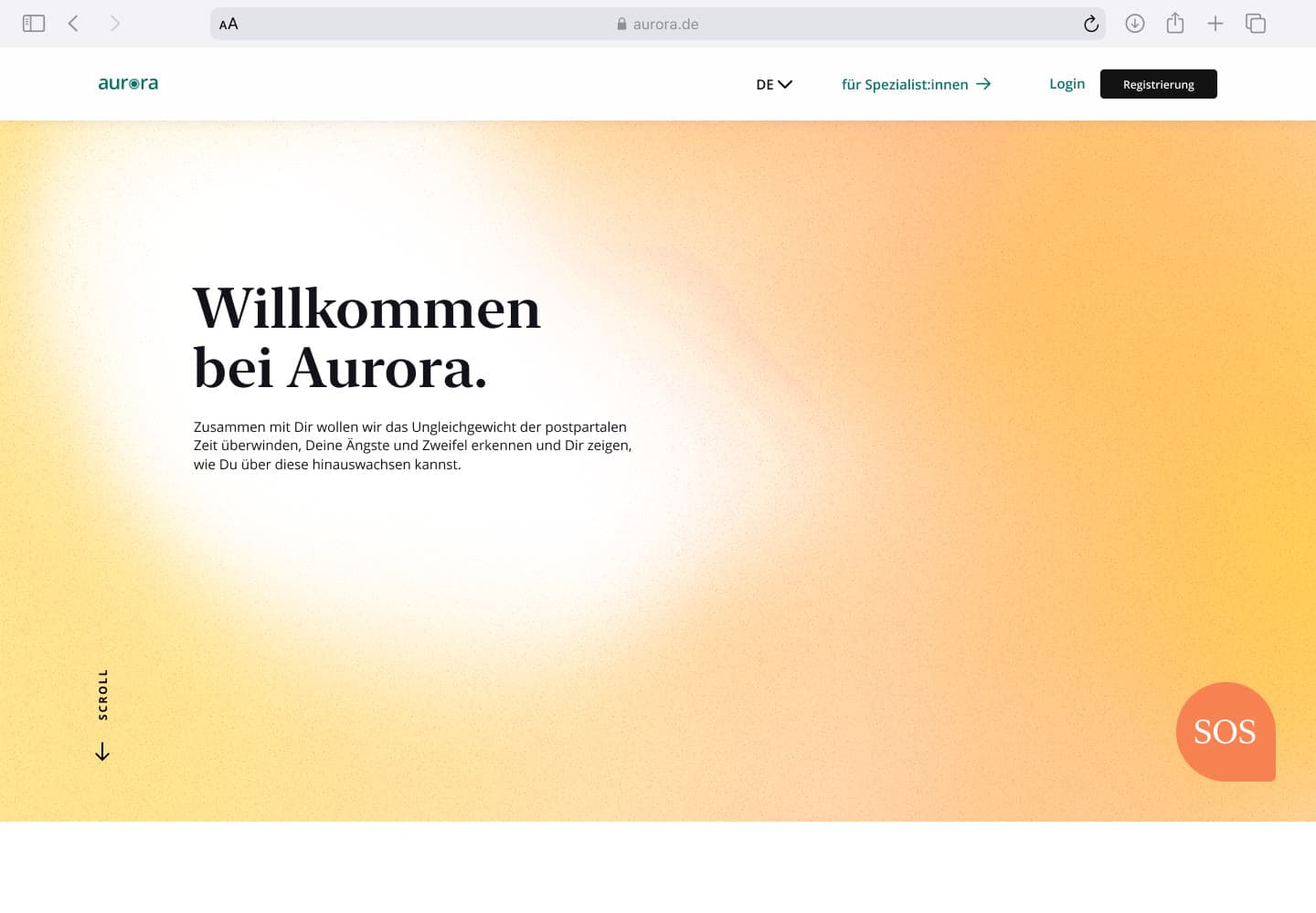
Home and landing pages
Arriving is the first thing that has to happen. The home page receives you with a warm, drifting aura and speaks to you directly. From there people place themselves and land on a page of their own: the one for affected women fully built out, the one for partners and relatives designed but never tested as a prototype.
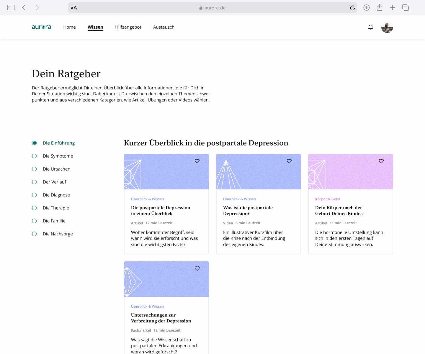
Guide
Articles, first-hand accounts, exercises and videos — guided rather than collected, in portions rather than as a mountain of knowledge. Every text can be listened to as well, because you rarely read with a newborn in your arms. The EPDS self-test runs on the page itself, and its result appears as a picture rather than a score.
Finding a specialist
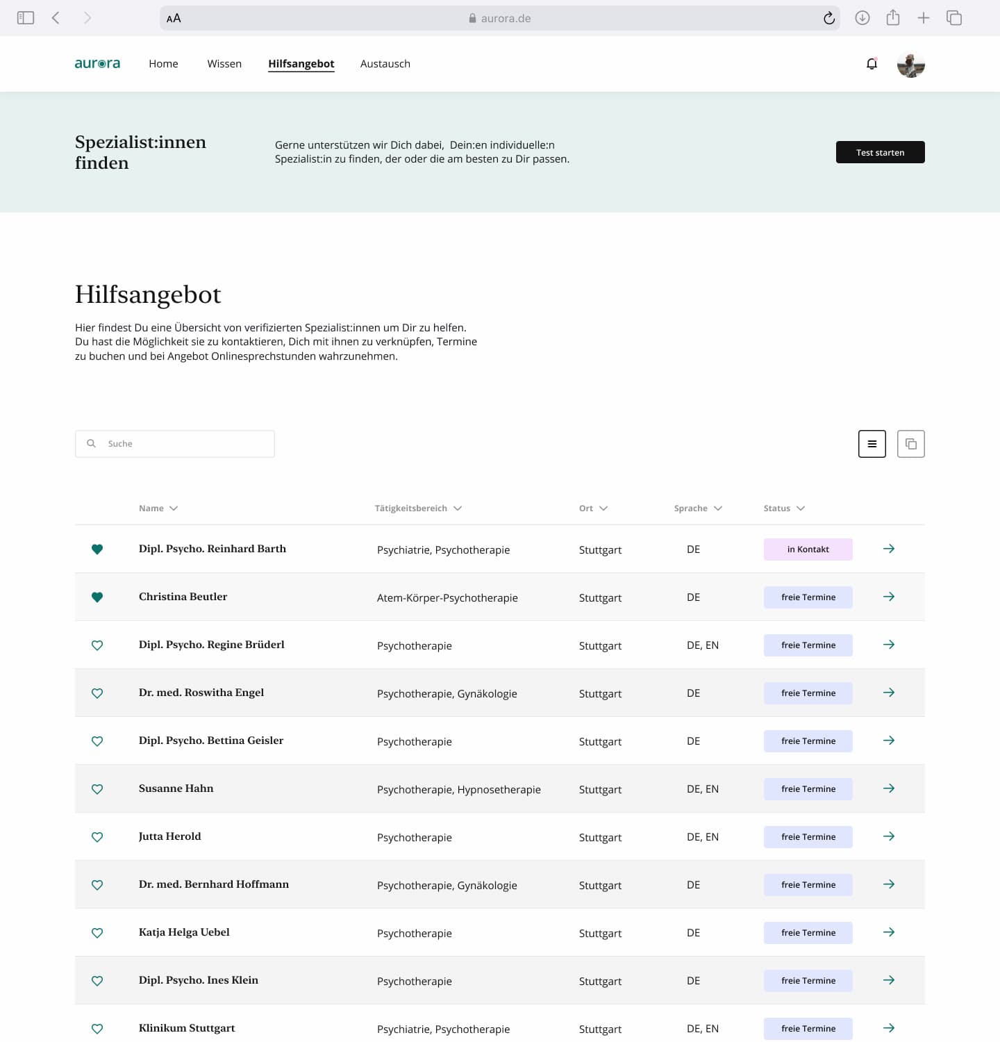
A directory of verified profiles saves the search through medical portals and shows where a place is free. Appointments and online consultations run through a private profile; a connection only forms when both sides exchange their ID. On the other side of it sits a desktop tool of its own for the practices.
Mentor programme
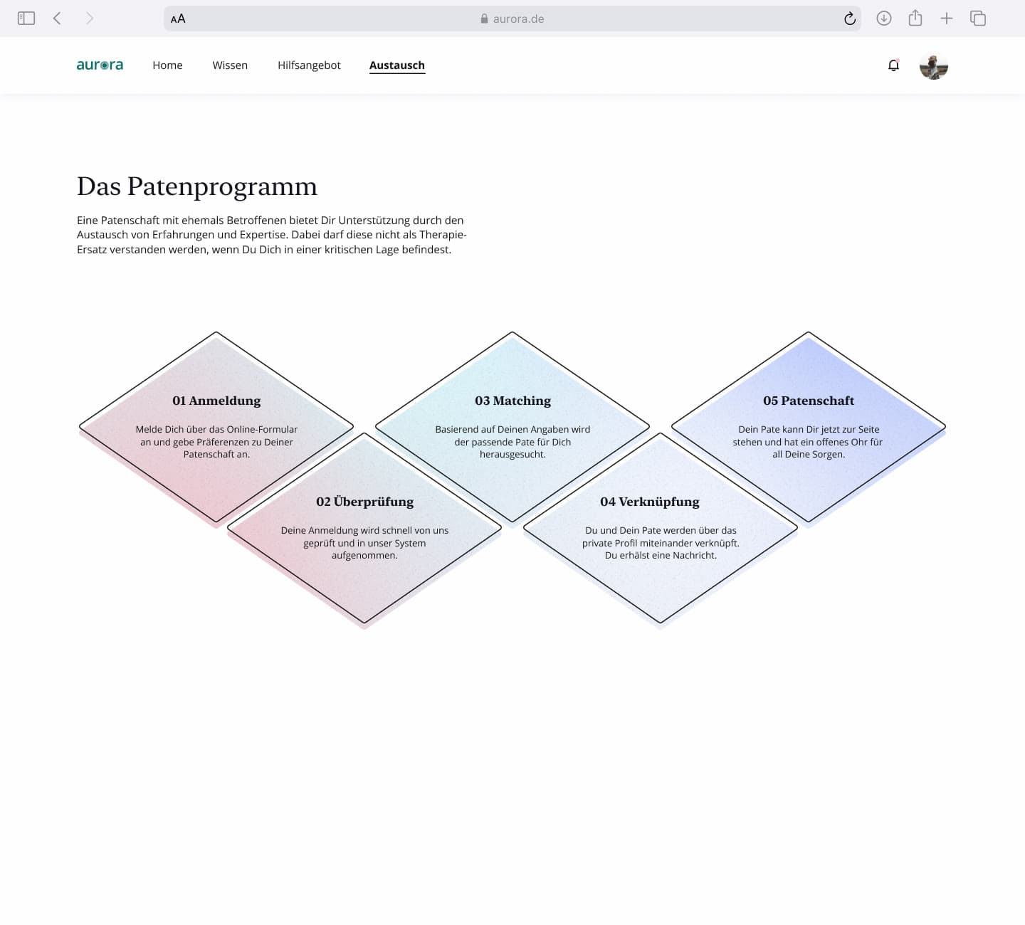
A match with women who have been through it and have an ear to lend. People close by often react with incomprehension, and those affected tend to play their own situation down. Here they can talk to someone who has lived it. The most frequent request in the concept validation.
App
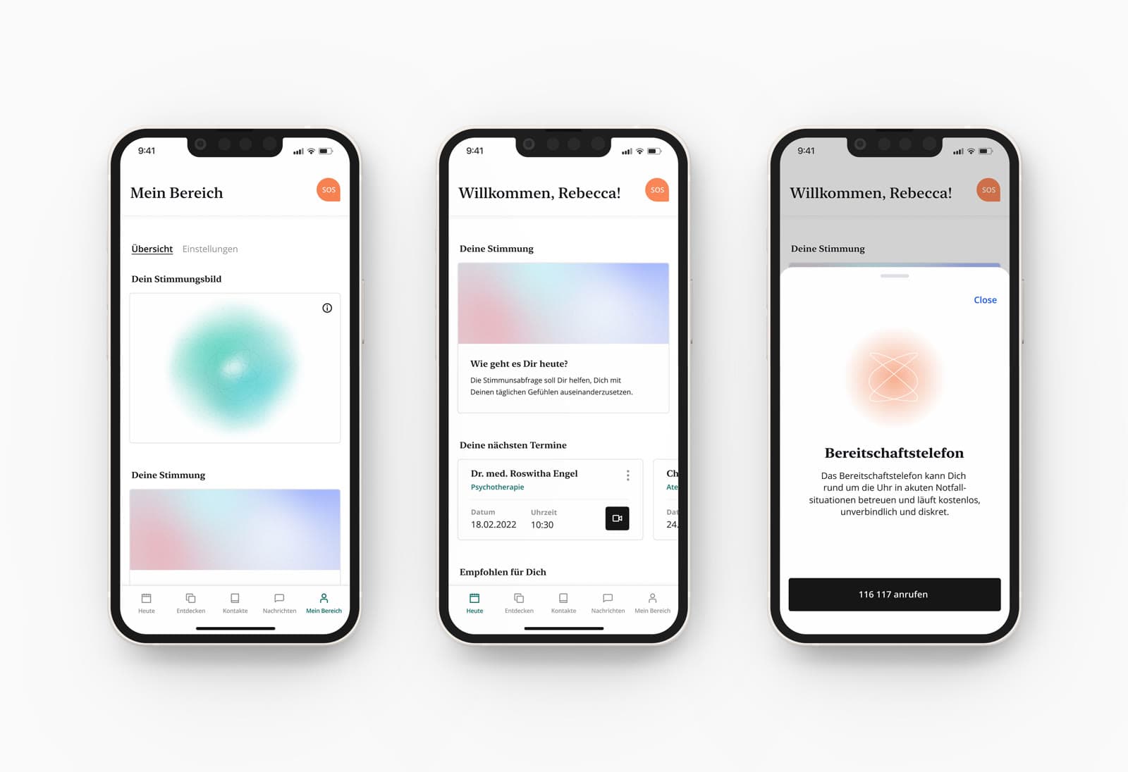
Explicitly a companion, not a replacement — the context is a different one when you are awake at night with one hand free. Guide, appointments, messages, the daily mood check and the SOS button. With a dark mode.
SOS
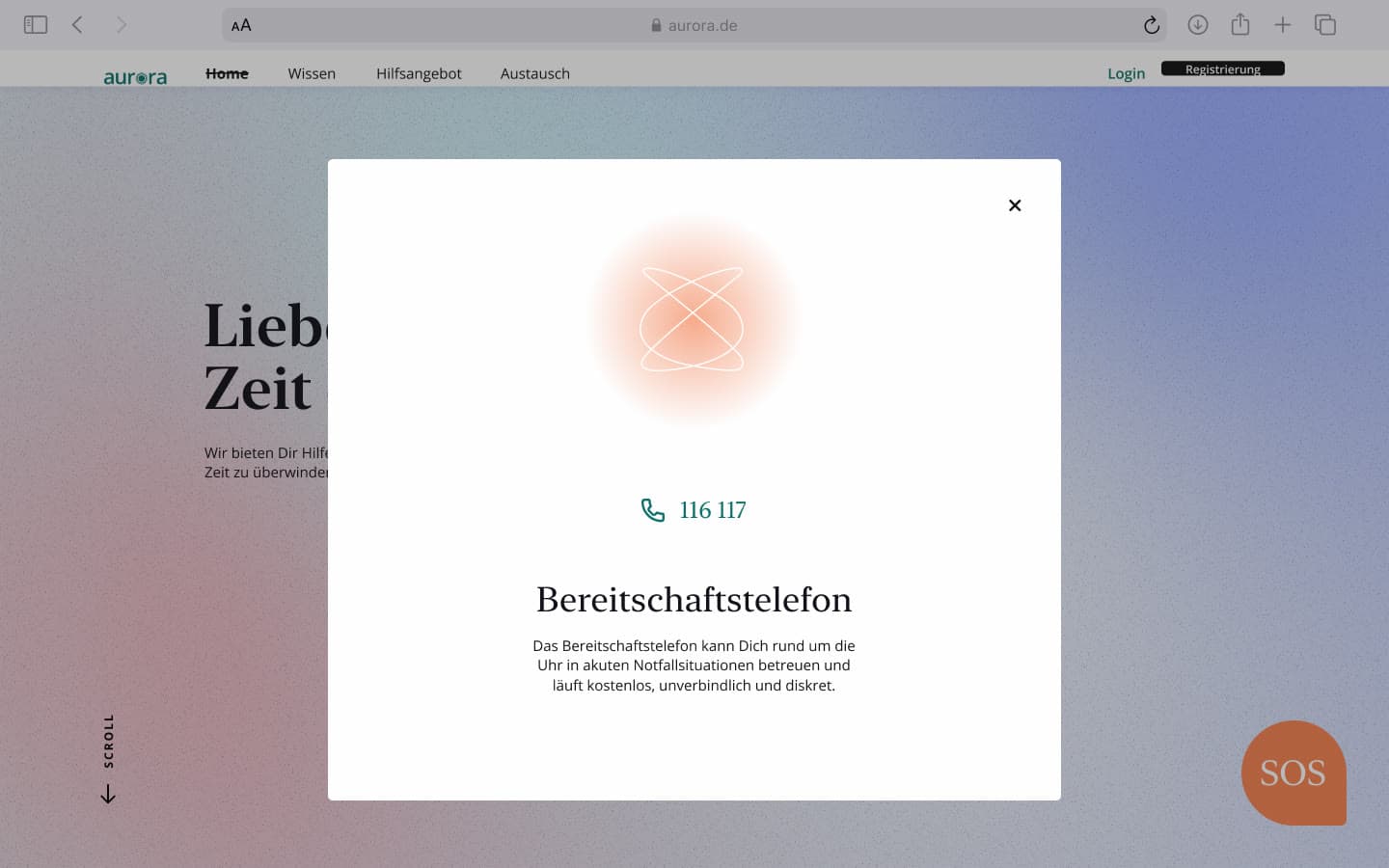
A button that sits above everything and opens the crisis line from any page — no navigation, no search. In severe cases the risk of suicide runs to seven per cent; nothing may stand in the way at that point.
Colour instead of photographs, movement instead of effect.
The site manages without a single photograph of a mother. Gradients carry the mood instead — striking but sparingly placed, out of a design system where each guide category has a colour of its own. That is precisely what affected women singled out for praise in the second test.
Each landing page has its own opening text and its own animation. That is not decoration: the page has to speak to its own group, be recognisable at a glance, and set itself apart from the others. Someone arriving as a partner should not feel they are reading somebody else's page.
Why Aurora?
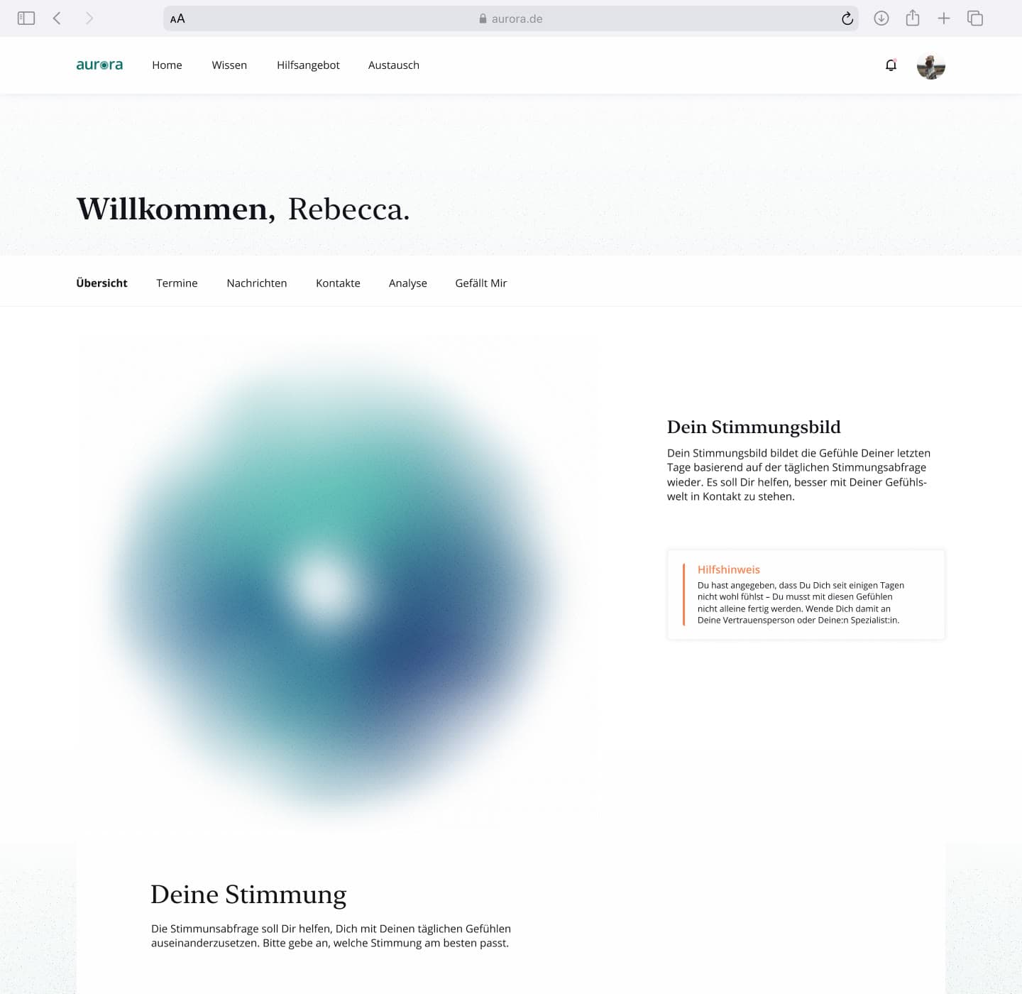
The scientific name for the northern lights is aurora. The platform is meant to point the way, and its colours behave like an aurora: separate tones running into one another. The “o” in the wordmark is the mood picture from the personal area — so the brand is literally what the user sees of herself.
The animations are the part of this work I made alone: the moving page covers and the mood picture.
Home page
The yellow aura drifts between the topics as you scroll. It is the warm welcome the site opens on.
Landing page
Pink into mint: a different opening text, a different movement. Every user group gets its own, and you know at once where you are.
Finding help
In the directory the colour steps back. Anyone here is not looking for a mood, but for an appointment.
A feeling does not need a score.
Five pairs of opposites on sliders every day, plus the result of the self-test. What comes out is not a value but a picture: a soft coloured aura that shifts slowly. Depression cannot be reduced to a number, and a bad score does not make a bad day any better. If the curve runs downward for seven days, the site speaks up on its own and suggests a conversation — with a partner or with a professional.
The same aura stands as the “o” in the wordmark.
A concept somebody ought to build.
Aurora stayed a concept with a click dummy, and the thesis says so plainly: the design is to be read as a hypothetical concept, to be checked by further validation and only then built. Independently of that, there would need to be medical screening after birth, better care and clear lines of responsibility. Bringing midwives and doulas in would create an exchange of expertise that works against the problem. We believe the concept took one small step in the right direction.
Every tester asked whether we were actually going to build it once the thesis was done.
The click dummy in Figma, as it stood in 2021 — the same build both user tests were run on.
- Hana Amer
- Jasmin Klement
- Alina Schadt
Bachelor thesis in Interaction Design, HfG Schwäbisch Gmünd, winter semester 2021/22. Research and concept were team work.